

We are all guilty of having read a book simply because we found the book cover intriguing. Book covers play a definitive role in persuading a tentative reader to turn over its first few pages. This is why writers invest a lot of time finding and finalizing the right cover art design.
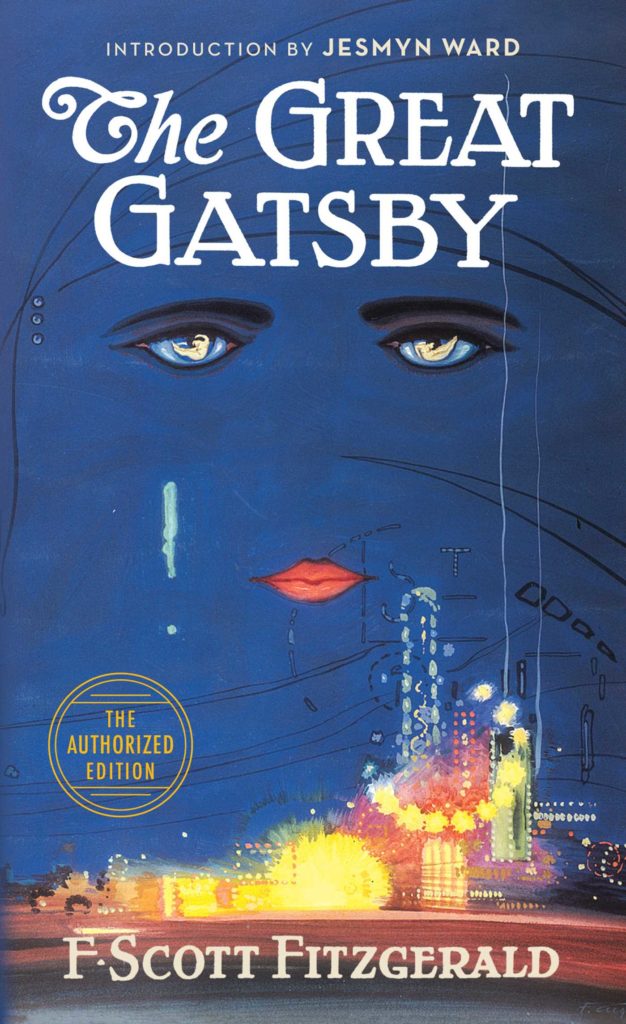
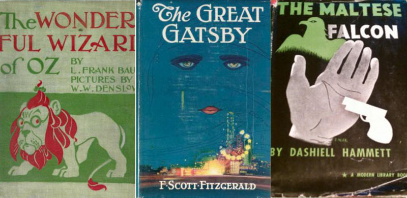
You might recall some pretty impressive book covers from your own list of favorite reads. The Great Gatsby is a perfect depiction of a book cover that is striking, memorable, and truly iconic, or you might recall Harper Lee’s To Kill A Mockingbird cover, which is just as iconic!
So, what makes a book cover iconic? In general, there are many visual elements combined to create a successful book cover design.
Start with A Layout
The layout of a book cover is the first element to consider. This defines the arrangement of the various elements on the cover, the images, and the text used. It will also define the sizing for each element relevant to one another.
To start, you need to structure your layout. You might want to avoid overly complex layouts since they lack a central focal point, and it often seems like the designer didn’t know where to place what element. In short, keep your book cover simple with just the right number of elements.
Don’t Forget Title & Typography.
Typography matters, but we will get to that in a second. The way your title is worded matters a lot more. As a writer, you play a key role in deciding the success of your book when you pen down its title. Make it readable, visible, and yet compelling.
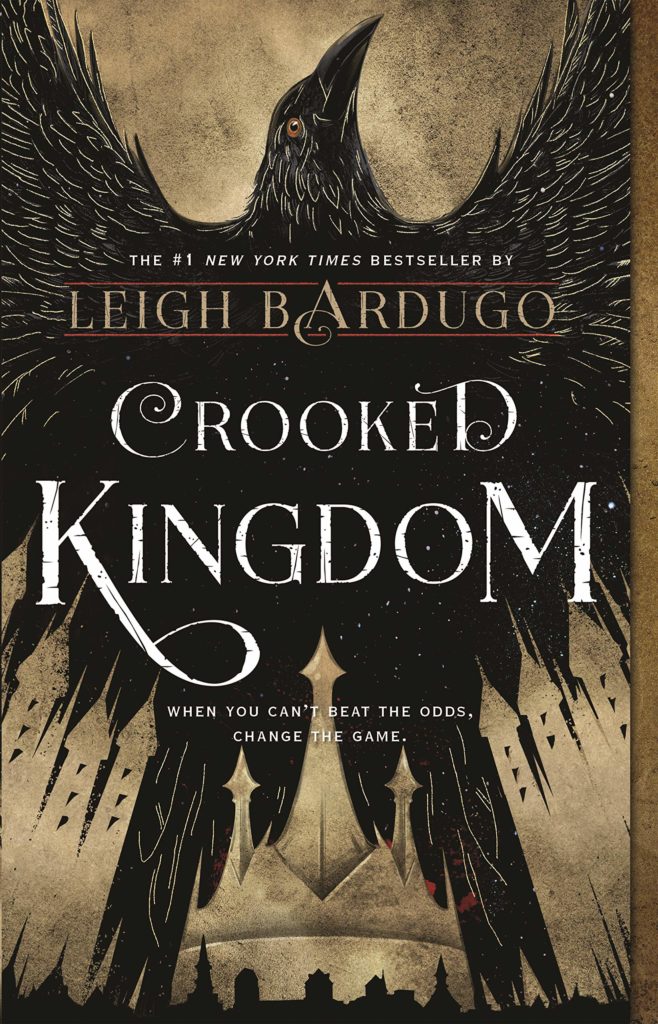
Once you have your title set, you should think of typography and visual elements that will complement your content. Typography helps the readers get a general idea of the message you are hoping to convey or the theme of your text; it stresses and highlights the meaning behind the words. Academic books, for example, use simpler, cleaner block fonts, whereas novels in the fantasy genre use calligraphy-style fonts. Leigh Bardugo’s New York Times bestseller Crooked Kingdom is a great example.
Tease with a Subtitle
When you pick up a book, you might notice a one to two-liner text section just below the title; this is the subtitle of the book cover. Adding a short subtitle to your book cover is an excellent way to grab readers’ attention as it works as a teaser. It essentially provides readers with a small glimpse of what the book entails. So, make it interesting and make it evocative!
Cover Art Matters the Most
The next (and probably most important) element is the cover art of your book cover. Your cover art will combine the elements we have mentioned above in a uniquely artistic way. The goal here is to create cover art that effectively depicts the general theme or idea behind the book without revealing too much. Writers and publishers make sure to use compelling images and graphic elements for book covers as visual elements such as graphics and imagery tend to be 6 times more memorable than text, after all.
You could add sharp vector graphics, illustrations or simpler photographic imagery. Fictional books, for instance, use imagery that is both abstract and expressive, whereas nonfiction books tend to incorporate more illustrative or vector-based visual elements. Don’t forget to develop a clear focal point and remember symmetry is your friend.
Choose the Right Color Palette
The color palette you choose for your book cover can make all the difference. Colors are scientifically proven to stimulate certain emotions in the human brain. The idea here is to use colors effectively on the book cover and communicate some message relevant to the content of the book. For example, black is used to signify mystery, thriller or horror. Red is angsty, bold, better suited for the horror genre but is also used to depict romance. Blue is used to give a sense of trust and is better suited to books revolving around political or nonfiction genres.
Colors play a vital role when it comes to typography because they make the text relate to the background image while also making it stand out. The right typography and color strategy is especially important in case there is no background image to use. The cover of ‘The Godfather‘ and ‘Psycho‘ are some examples. Color Palette is also highly important when using texture and patterns to add non-diverting details.
So, now you know what elements make a book cover an iconic book cover.