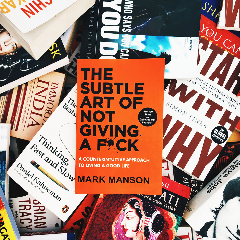
Book covers play a decisive role in the way you market your books to your audience. Not only do they communicate the general theme behind the story or topic, but they also enhance the visual appeal of your book, compelling readers to purchase it. You want your book cover to be unique, powerful, and intriguing.
But how do you make a book cover that interesting? Is there any secret to designing book covers that grab attention? The answer is ‘yes.’
Tips To Create an Incredible Book Cover Design
Luckily for you, there are certain patterns we find in successful books that help us understand what elements and what design techniques lead to successful cover design art. Your book cover should be evocative, attention-grabbing, inspiring, and marketable.
Here we will be providing you with some of the top tricks or book cover ideas to creating attention-grabbing book cover designs.

Add a Pop of Color
The first thing you want to do is create contrast by adding a pop of color. This means you want to add a strong transition from a lighter element to a darker element or through a strong contrasting color. For instance, you could highlight your central element in the cover art with a bright, contrasting color to make it stand out.
Space is Your Best Friend
Space is your best friend; you know how we like to space text apart in smaller paragraphs, so it is easier on the eyes? You want to do the same with your book covers.
Book covers can be incredibly complex with plenty of elements included, but you need to make sure you leave enough white space between the elements, so it is easier to identify each element (the text, the subtitle, the cover image, etc.) clearly and add more visual appeal. For example, you should use white space to make sure your background imagery or graphic elements do not distract or overlap the text of your book.
Try to Communicate Your Genre
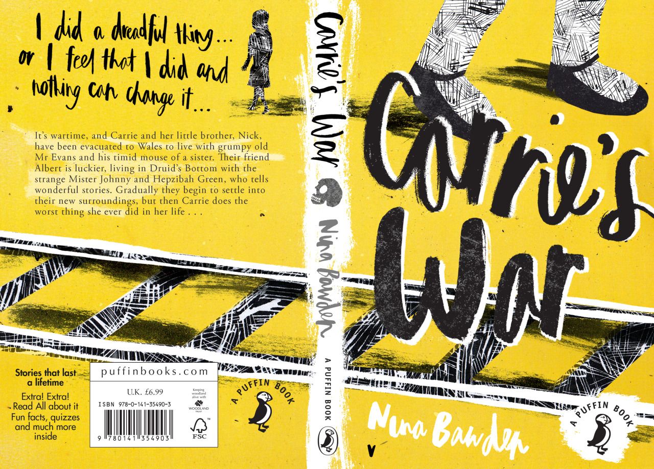
The thing you will want to be mindful of is creating a book cover that correctly communicates the genre you are displaying. For example, if you are designing a book cover for a fantasy novel, you will want a graphically rich element; on the other hand, if you are designing a cover for an academic book, it can get a bit trickier since the topics can be incredibly specific or extremely generalized. You could add simpler elements or abstract shape configurations, all while keeping it topical.
Add a Compelling Subtitle!
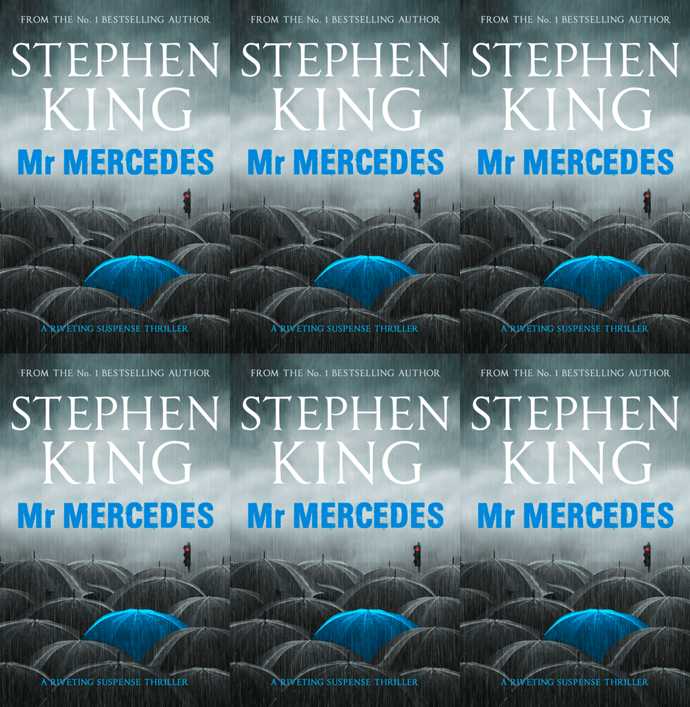
The small set of text right below the title is your subtitle. The subtitle plays quite an important role in your overall book design. It gives the reader a small glimpse of what the story dictates without revealing too much. Consider it an additional context for the title or a teaser that manipulates potential candidates into buying and reading your book. While the title helps grab the reader’s attention, the subtitle keeps ahold of this attention.
The right subtitle can compel the readers to buy the book, so words need to be chosen very carefully! Subtitles should be short and specific but should pack enough information so that the reader has an idea of what he can expect from the book.

Pick the Right Font
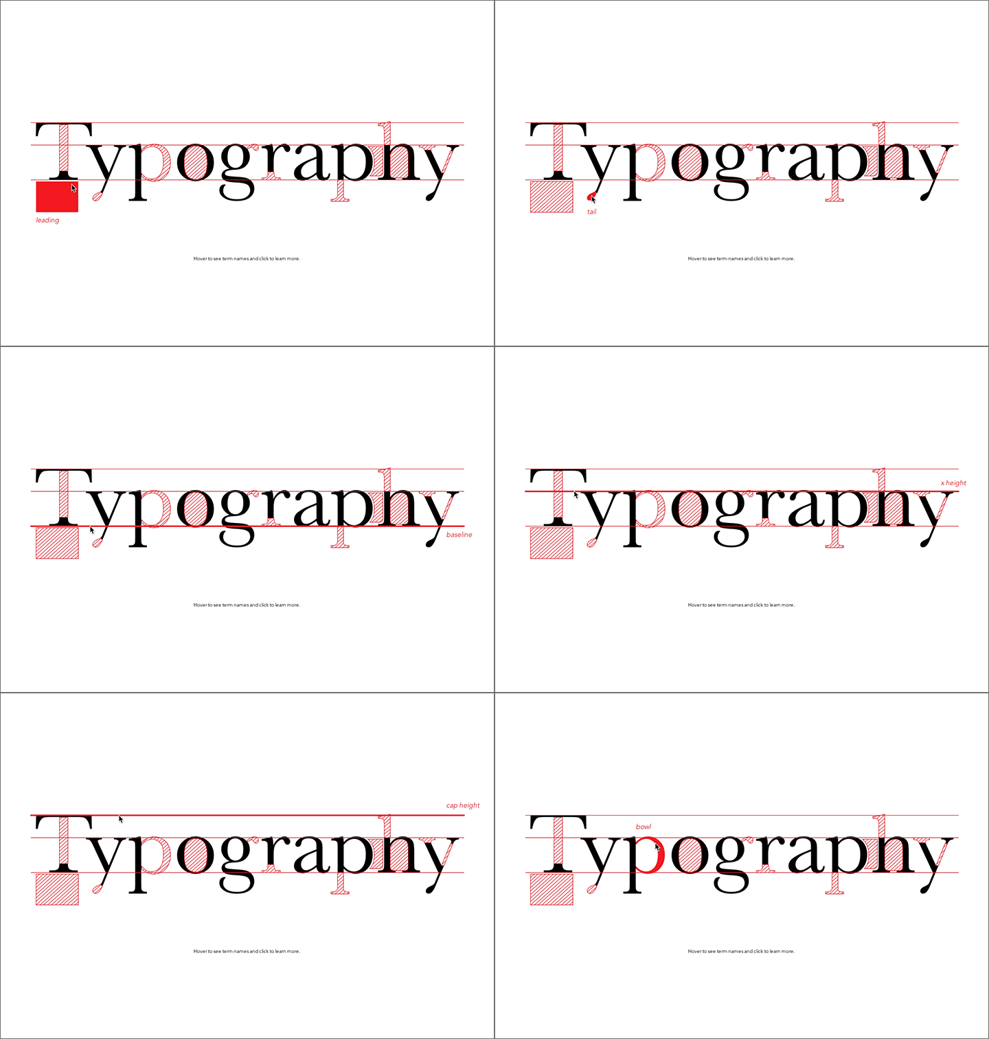
Typography matters. Pick the font used for your cover art in accordance with the theme or genre it follows. For example, if you are portraying a political story, you can go for a slab serif font as it is more suitable to the genre. If your story is a thriller, sans serif or gothic font type might be more appropriate. Similarly, if your story is that of a fantasy genre, you might want to go for a font with calligraphy-like elements.
Hire a Professional
Finally, hiring a professional to assist you is the best secret to getting optimum results when designing your book cover. A professional designer will identify the correct layout for your book cover, will be able to place the elements, so they are symmetrical, aligned, and in order, and above all, they work well in binding together the entirety of your cover art.
