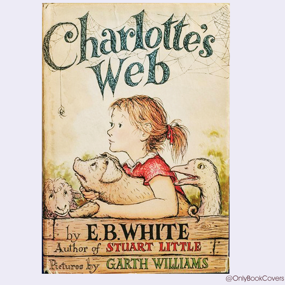
The book cover of “Charlotte’s Web” is exceptionally good for several reasons.
Firstly, its simplicity is striking, with a clean white background drawing immediate attention to the central image: a delicate spider, Charlotte, suspended gracefully above a vibrant red barn.
This imagery captures the essence of the story’s rural setting and the unlikely friendship between Charlotte and Wilbur, the pig.
Secondly, the cover conveys the emotional depth of the narrative through its portrayal of the characters’ expressions: Charlotte’s thoughtful gaze and Wilbur’s curious demeanor evoke empathy and intrigue.
Thirdly, the font choice for the title is playful yet elegant, reflecting the whimsical nature of the tale while maintaining a timeless appeal.
Overall, the cover of “Charlotte’s Web” effectively encapsulates the charm, heart, and enduring appeal of E.B. White’s beloved classic, making it instantly recognizable and captivating to readers of all ages.
Does the book cover give the readers a sneak peek of what’s to come? / 90%
Does the book cover let the readers know the book’s genre? / 80%
Does the book cover introduce the book’s protagonist? / 70%
Does the book cover set the right tone for the genre of the book? / 80%
Book Cover Typography / 90%
Book Color Palette / 100%
Book Cover Imagery / 100%
Charlotte’s Web by E.B White was first published in 1952 by Harper & Brothers. Illustrations were created by Garth Williams.
The novel revolves around a livestock pig named Wilbur and his friendship with Charlotte, a barn spider who #writes messages praising Wilbur in her spider web in order to save Wilbur from being slaughtered and to persuade the farmer to let him live.

